 Back to blog
In a previous blog article we talked about the Pros & Cons of using a responsive web design. In this article we take it one step further and apply similar principals to an email campaign.
If you read your email on a regular basis using a smartphone (who doesn't these days), you probably know that it's an experience that can range from fantastic and convenient to extremely annoying. While an email newsletter can look superb in the Inbox, when squashed into a tiny screen, it can become quite painful to read, with tiny fonts, narrow columns and messed up layouts being common issues.
So why optimise email for smartphones or tablets ?
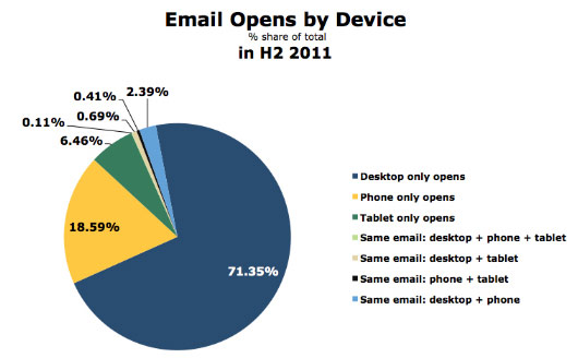
If you send email newsletters, it's likely that a growing percentage of your subscribers are reading your messages on an iPhone, tablet or similar. When we last surveyed our database on email client popularity in 2011, we found that almost 19% of email opens occurred on a smartphone, rising dramatically from a mere 4% of the market when we had last ran the numbers in 2009. iPhone & iPad devices accounted for over 90% of these reported opens. Android more than likely will start to take up more of these stats towards the end of 2012 as they become more popular (refer to our recent article on Attack of the Android...).
What this means for designers is that getting your email newsletter to display optimally on mobile devices is just as important as ensuring it can be read in long-standing email clients like Outlook and Gmail. In fact, mobile email client usage is soon set to beat both that of webmail and desktop clients. This means that providing a less-than-optimal reading experience on the small screen may not only inconvenience a few recipients, but eventually the majority. This could lead to much lower click rates… and eventually much lower ROI on your campaigns.
Beyond mobile optimised email?
So you have an awesome email that's optimsed for mobile… but when they click on your call to action it sends them to a landing page thats does not have a responsive design?
What more than likely will happen here is that the user will bounce off the page and not complete the actions / offers you had intended for them. Again, there goes your ROI.
Random thought: Do you think that smartphone / tablet users are more likely to buy products online? Let us know what you think below.
Need help optimising your email campaigns for Mobile? Contact us here.