 Back to blog
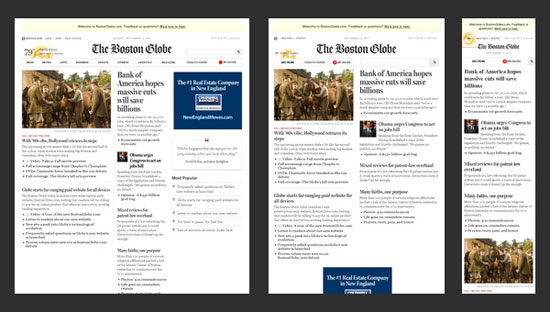
Responsive Web Design essentially means that your website will adjust itself according to the screen size it's being displayed on. As a result, users across a wide range of devices (smartphones/tablets) and normal web browsers will have access to a single source of content, laid out so as to be easy to read and navigate with a minimum of resizing, panning and scrolling. (Also see our article on Responsive Email Design)
How does a Responsive Web Design work?
Cascading Style Sheets 3 are the big hero here. By using the @media rule, the stylesheet can be swapped out with the current view for a more appropriate layout based on the viewer's screen dimensions.
Pros of Responsive Web Design
- Consistent content: You no longer need to have a separate mobile website which could double your updating efforts
- Smoother user experience, the user receives an optimised experience based on their device
- Recently, Google also went on record promoting responsive web design as their preferred method for mobile sites... which could mean they will start to factor it into its rankings in the near future
- Stats: If you are redirecting users to a mobile-friendly version of your website, your stats are going to be split between the two, which could make for difficult analysis and reporting. To get insights on mobile visitors, create a "mobile-only" segment (note that by default, Google Analytics puts all the tablets under "Mobile" segment).
Cons of Responsive Web Design
- Load time: Mobile users will be downloading unnecessary HTML/CSS code (not a huge deal) and most of the time, images are simply scaled down, NOT resized — negatively impacting the load-time (bigger issue)
- SEO: As it's relatively new technology, the effects of using a responsive design on your SEO rankings is unknown
- Development: The initial development of responsive web design takes much longer. Generally it is much easier to create RWD from scratch than to convert an existing site
- Design: You will need to design several different layouts via wireframes with your graphic designer. You will need a minimum of two layouts, smartphone & full site. In our opinion this is enough as tablets can usually display a full site and remain usable.
We love the idea of responsive web design. It's a great solution to the existing problem of presentation of websites across multiple devices. And let's face it, it's inevitable that more and more platforms will become available to make the internet even more portable and accessible.
Thinking about building a responsive website? Contact us to talk over how we can make it work for you.