
If you’ve landed on this page, you’re probably feeling like you have a whole lot of data and want a better way to view it. Hence you’ve searched data visualization.
Data visualization is the process of turning boring numbers into amazing, customisable charts and tables. That is our unofficial definition by the way.
Whilst you get the idea of data to charts, what you may not have considered are other influences on the ability to do this, such as;
- How many data sources do you have (eg, traffic analytics, marketing/sales automation software, CRM, etc)?
- How can you extract data from those sources?
- What data visualization tool do you need?
- Do you have any experience working with data visualization tools?
- Can you match the visualization to how your Executive team report?
There are more considerations, but that’s enough for now. If you are unsure about any of these, that's where we come in.
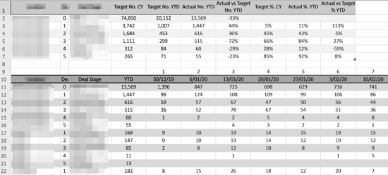
Data visualization can really be a situation of ‘you don’t know what you don’t know’. As a result, businesses can get stuck here not knowing how to move forward with their data. We have worked with many brands from many industries helping them turn pages like this
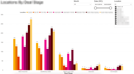
into visualizations like this that help drive business decisions
We can work with all data visualization tools and all manner of data sources, from simple spreadsheets to SQL queries.
If you feel there’s a better way to view your data to help you make informed business decisions, but just aren’t sure how to get there, get in touch. We love a challenge!